
As students, we were assigned a brief to design a book cover for a famous typographer. I chose Alex Trochut - a Spanish illustrator and graphic designer who specialises in advanced typography.
Trochut has become an acclaimed designer, having done incredible works for world-famous brands such as Pepsi and Fila and even pop artists like Katy Perry.
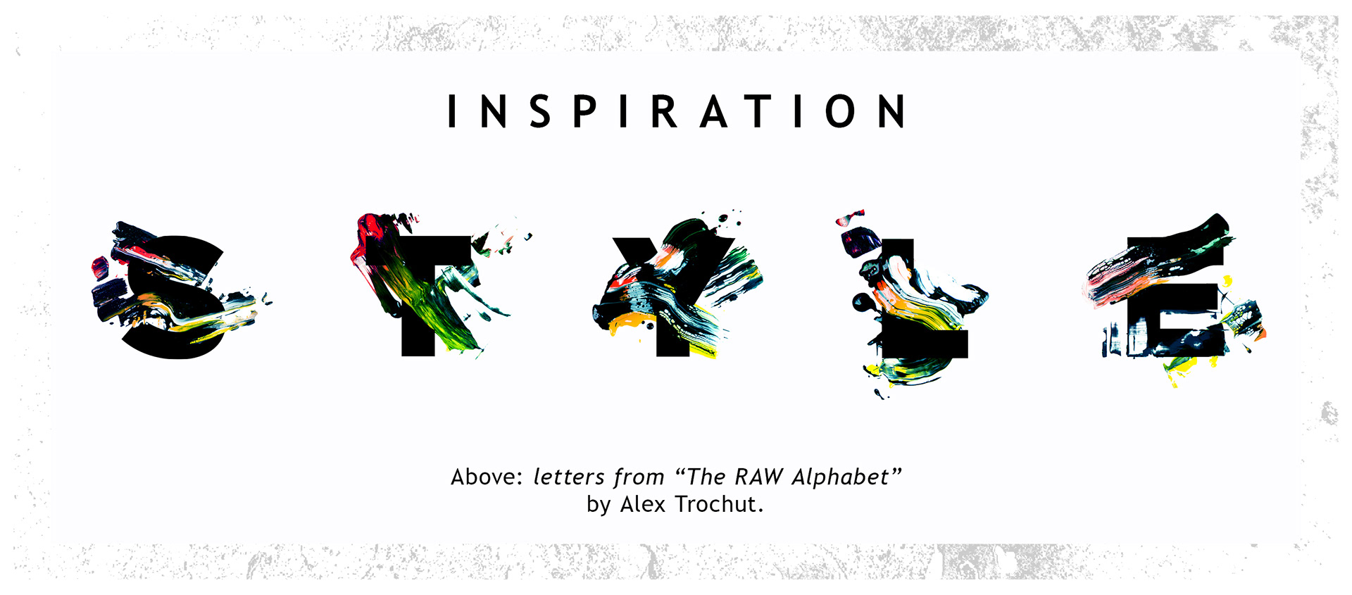
He speaks about his personal style in an interview with Design Boom: “My work is expressive. I have a tendency to mix geometric and fluid forms” (Trochut, 2013).
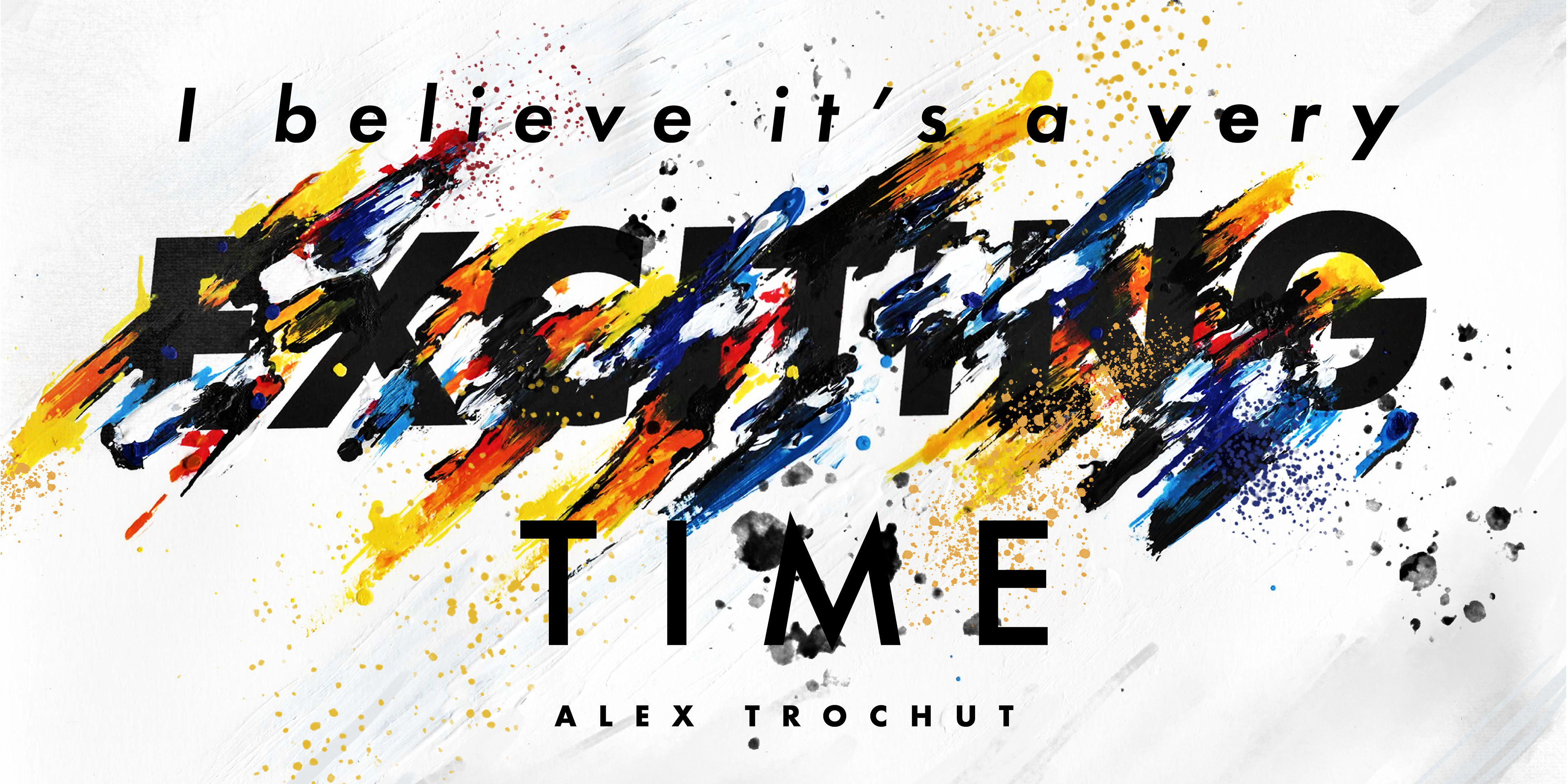
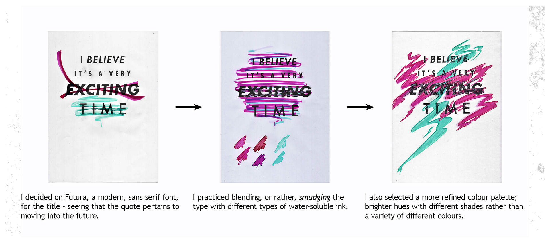
When it came down to designing a book cover (more specifically, a biography) for Alex Trochut, I identified one particular quote from the interview with designboom that I thought would add a sense of optimism and inspiration for young creatives;
“I believe it’s a very exciting time.”
This became the title of the biography.
The Final Design


With the final book cover design, I chose a simple white background to resemble a canvas, seeing that Alex Trochut is an artist as well as a graphic designer. By having black-plated pages, it adds a sense of sophistication, which is also appropriate seeing that Trochut is a professional designer.
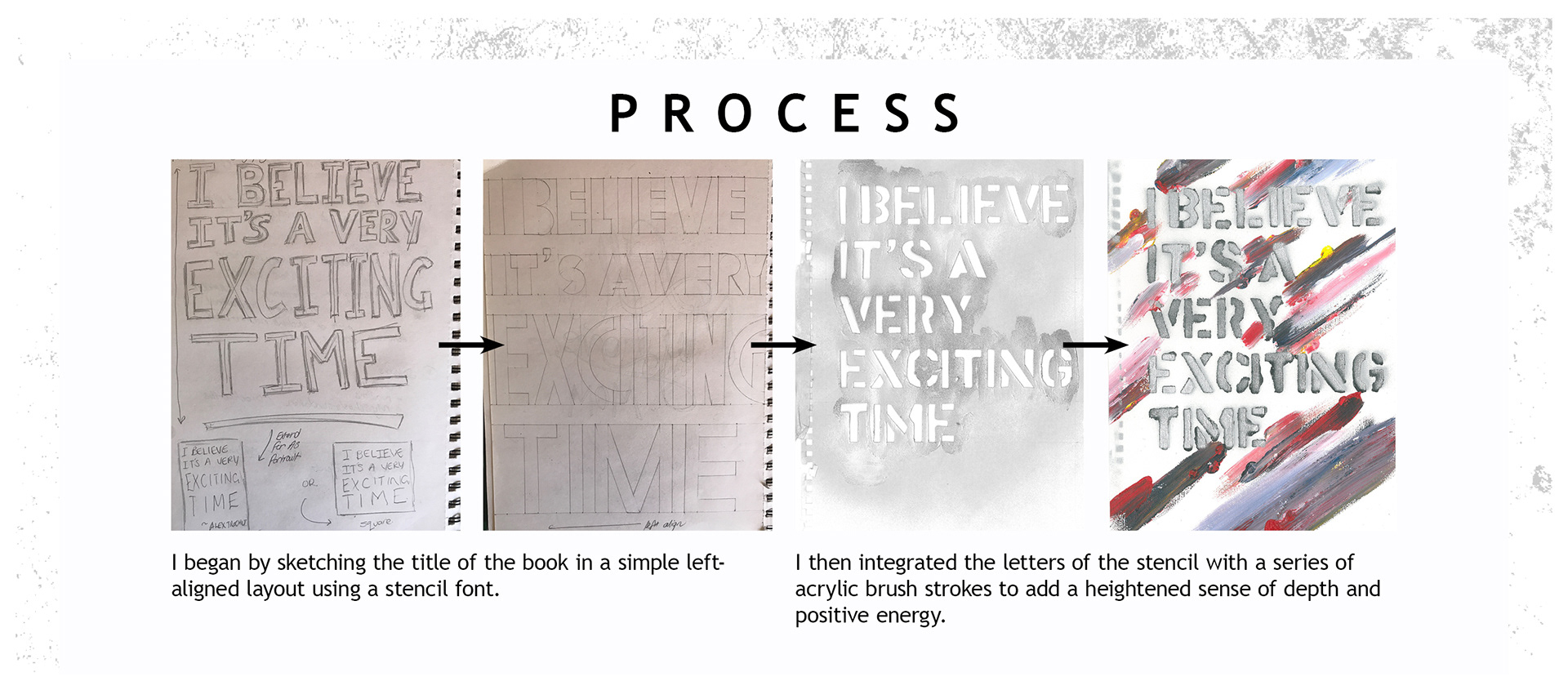
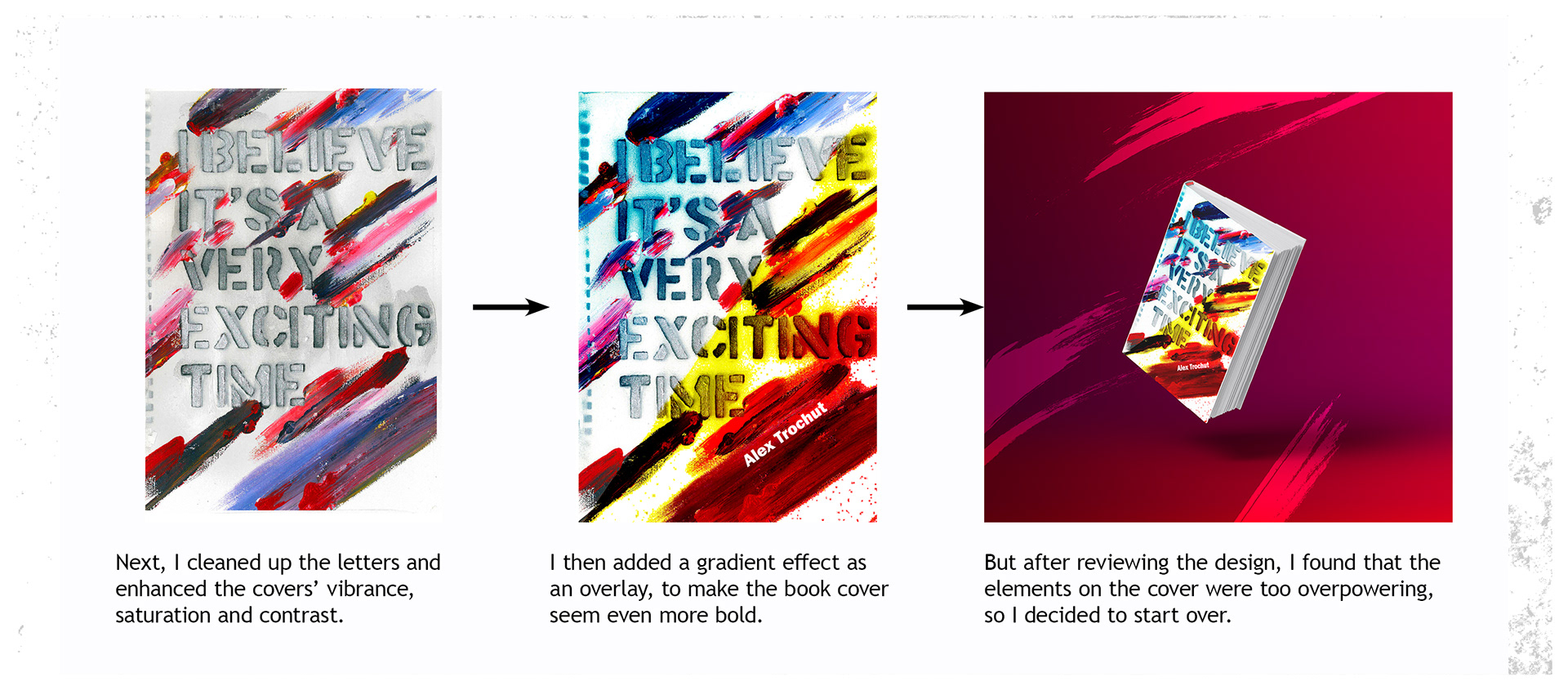
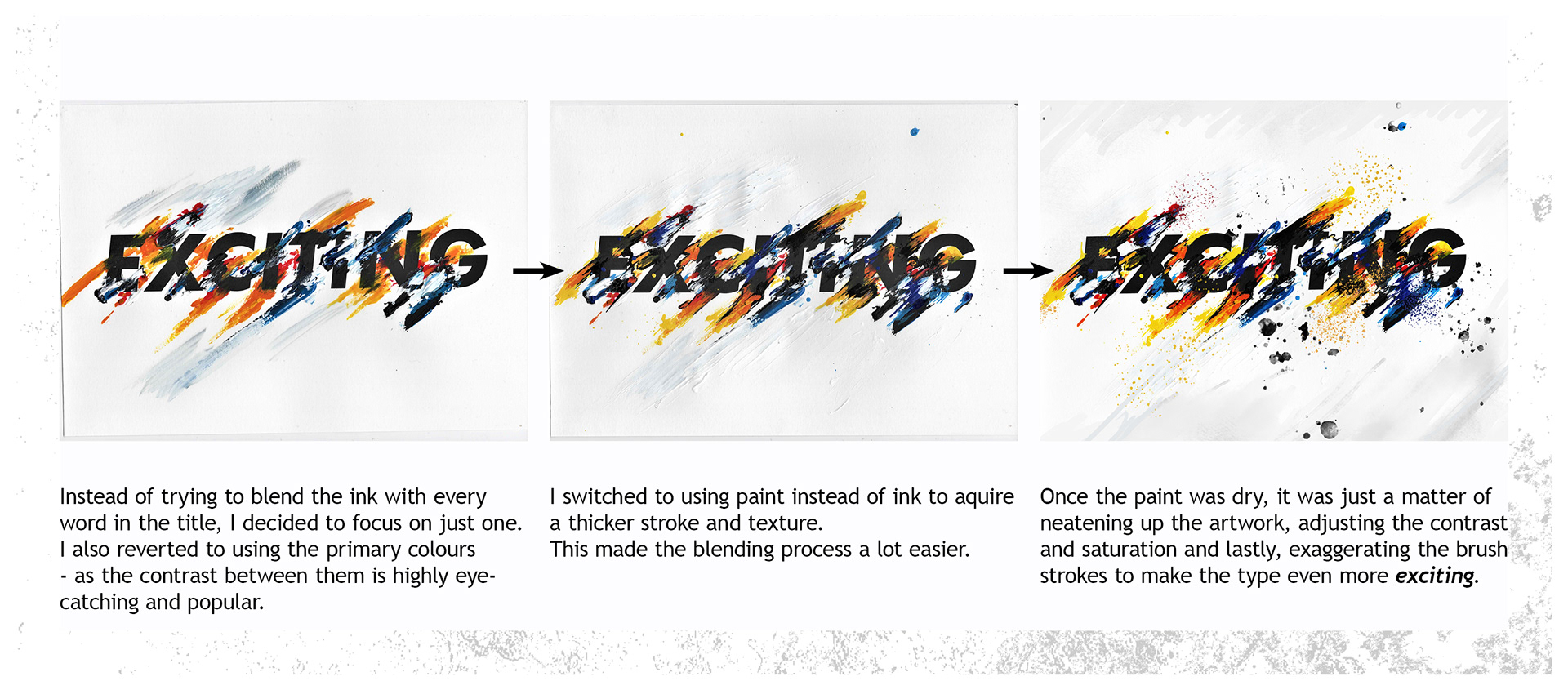
Through working on this project, I learnt a lot about different kinds of rough techniques that can also be incorporated into the designing process when working on typography (like something as raw as painting and using wet media). More importantly, I learned that sometimes, less is more and that there's always room for improvement.